
S&P500 still beats inflation
- Analysis
- May 22, 2022
The S&P500 is much less successful in an inflation-adjusted view, but it still beats the inflation rate.
S&P500 beats the global inflation rate
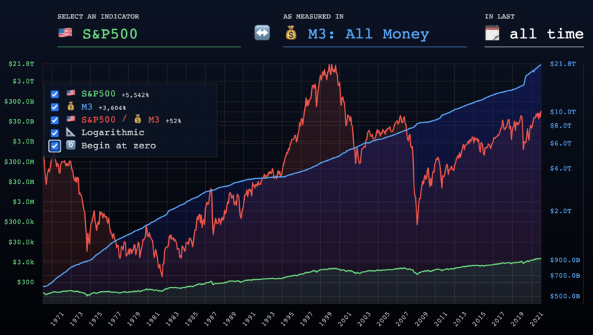
If you look at the S&P500 price adjusted for inflation, it quickly becomes clear: the SPX price is much less successful than it seems without taking inflation into account. While the S&P500 price recorded a price increase of around 5,540% over a period of 50 years, the circulating money supply increased by around 3,600%. This leaves the SPX course with only a price increase of almost 52% in a period of 50 years. This corresponds to a price increase that the Bitcoin price manages in a day adjusted for inflation!
S&P500 price rises 333%, Bitcoin price rises 45.554 %
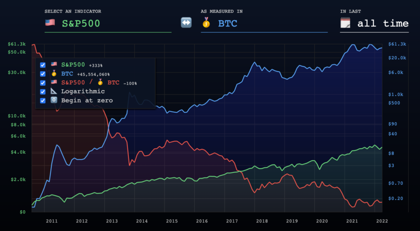
While the S&P500 price has only increased by around 333% in the last 11 years, the Bitcoin price has recorded a price increase of more than 45,500%. This makes it clear: Bitcoin has been the clearly better investment strategy than the S&P500 over the past ten years. Will the trend continue in the next 10 years?
S&P500 price falls from 4,818 to 3,900
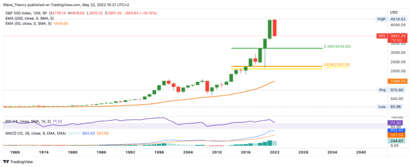
Over the past five months, the S&P500 price has fallen from around 4,800 to 3,900. This makes the S&P500 anything but successful. While the RSI has been in overbought regions for quite some time, the MACD’s histogram is now ticking bearishly lower for the first time in four years. In fact, this could be the beginning of a massive correction.
Does it remain with a correction movement of around 20%?
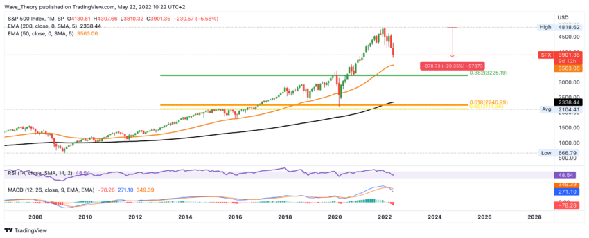
So far, the SPX price has fallen around 20% since it reached the all-time high of around 4,800. But whether it remains at 20% is questionable. Finally, the SPX price only encounters significant Fibonacci support at 3.225. If the SPX price breaks this bearish, significant support is only waiting for the SPX price again between 2,100 – 2,350. This is where the S&P500 encounters the 200-month EMA and the important Golden Ratio support. In addition, the average price of the S&P500 over the past 14 years is around 2,100.
A Death Cross for the first time since the flash crash in 2020
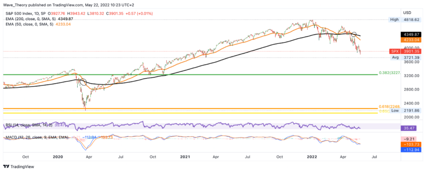
Now there was a death cross of the EMAs in the daily chart. An event that last occurred during the flash crash in 2020. This confirms the bear trend in the short to medium term. Should the SPX price correct to the 0.382 Fib level, this implies a downside potential of around 17%.
Disclaimer
All information contained on our website is researched to the best of our knowledge and belief. The journalistic articles are for general information purposes only. Any action taken by the reader on the basis of the information found on our website is done exclusively at his own risk.